Contrast

The first thing that you seen when you look at this ad you see the Coca-Cola. It is the biggest thing on the ad. It is big and bold. The background is lighter then the bottle so it makes the bottle stand out.
Repetition

Coke is said to times in the ad. That way you know what the ad is about. Not only is the coke said twice but the color red is used twice as well. The ladybug in the bottom right corner is the same as the coke.
Alignment
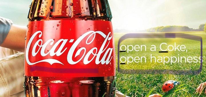
The main words in the ad are not right in the center but over the the right a littler bit. The only Letter in the whole ad that is capital is C in the Coke. The rest are lower case and that makes the Coke more important then the rest of the words. That is good because the ad is about Coke not the other words.
Proximity

With this ad there is not guessing what it is about. You know that is as soon as you look at the ad. It is simple and not to much on the eyes.
Color

In this ad RGB is used for the colors. It is used because when this ad is looking at is will be on technology and not paper. The made colors are green and red. It is easy on the eyes.
Conclusion
This ad is great at getting the point across and being heard but its not all in your face. It is easy on the eyes and it can be remembered. When you look at this ad it brings back fun and happy memories when you had a coke in your hand.
